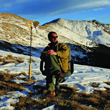
Does This Match My Gaiters?
I’m currently suffering from option paralysis. It’s a term penned by author Douglas Coupland meaning “the tendency, when given unlimited choices, to make none.”
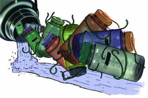
I’m also suffering from water bottle stupefaction. It’s a term I originated to describe my shock that Nalgene bottles now come in 12 colors and that I’m actually languishing over which color to order.
I was always content with my standard gray-with-blue-cap bottle. Never once did I think while on the trail, “Damn, I bet my refreshment enjoyment would leap exponentially if this water bottle were raspberry red.” Never.
And never did I expect after losing mine somewhere in New Mexico that I’d spend time debating water-bottle color options. Yet here I am, mulling hues with the same deliberation as a Miami Beach newlywed selecting carpeting.
When Emanuel Goldberg, a chemist in Rochester, New York, formed the Nalge Company in 1949, I’m sure he never fancied that his polyethylene pipette holders and centrifuge bottles would someday evolve into an outdoor clothing accessory. But form just can’t resist meddling with function, especially when it comes to colors.
I’d find this profusion of water-bottle complexions easier to accept if the online outdoor companies did not include customer comments. Normally when I buy gear online there’s a customer recommendation like, “This tent, while pitched at 23,000 feet along the spine of a Burmese mountain range, resisted 87-mph winds like a nylon Fort Ticonderoga.”
But on greatoutdoors.com, there is a water bottle comment that reads: “Very sexy. I love my sexy pink Nalgene. But I had to switch the red cap with a blue cap it looks so much better. I take it to all of my classes and pom practices.”
Not that I was considering pink, but I don’t need to know that I’m purchasing gear endorsed by Suzy Spirit, whose idea of roughing it means riding in a Saab without MP3 capability. And applying the word sexy to an outdoor product is like applying the word rustic to Victoria Secret lingerie—it dims the appeal.
So with pink (both red and blue caps) eliminated, I still must decide from sea blue, amber ale, grey with blue lid, grey with black lid, raspberry red, Just Purple, yellow, moss green, sage green, and vibrant purple.
Of course, I could free myself of this water-bottle dilemma by finally buying a Camelbak. But I’ve never been a big fan. I once borrowed a friend’s, and for the entire hike I experienced the weird sensation of having a cyclopean-sized blister on my back. Plus, have you noticed how everyone who owns a Camelbak overbearingly says “hydrate” instead of “drink?” And they just don’t say it, they announce it: “I need to hydrate.” I’d rather own a pink Nalgene (with recommended blue cap) than feel gear-obligated to declare “hydrate” every time I quenched my thirst.
Maybe my color indecisiveness is warranted. After all, auto and pharmaceutical companies spend millions each year researching the psychology behind colors. Gold, for example, conveys wealth. Red exudes risk. Baby blue casts weakness. And… damn. Baby blue conveys weakness? Excuse me while I change shirts.
Extremely extreme-adventurer Will Steger detailed in his book, Crossing Antarctica, how tent colors altered moods, especially while hunkered down for days at a time in hellish blizzards. Yellow tents were better than blue tents because yellow conveyed optimism and spaciousness while blue felt claustrophobic and dispiriting.
I don’t think, however, I’d experience optimism carrying a yellow water bottle. Instead, I’d shamelessly feel like I harbored some odd dairy fetish for drawn butter. Or worse, that my bottle suffered from jaundice.
I like moss green, but it’s the same color as my rain parka. That would invite too many insecurities, forever fearing that if I tried to drink in the rain other hikers would view me as some kind of strange alpine fashion don, flaunting a carefully considered outdoor clothing ensemble.
Just Purple is eliminated on the basis of adjective annoyance. If it’s just purple, why not just call it purple?
Raspberry red? No, it’s the same color as hummingbird feeders. Bears and mountain lions are enough worry. I don’t need the added fear of being mistaken for an ornithological luncheonette and be the source of some weird Hitchcockian scene involving hummingbirds and maybe a confused squirrel.
Too much visual chicanery with the color amber ale. It would prompt long hours around the campfire trying to bounce quarters into it.
Sea blue would make the water look briny, creating the uneasy sense of gulping a tidal pool. And despite repeated assurances from the brain, I know my tongue would still suspiciously probe the water like John Steinbeck in the The Log from the Sea of Cortez, making sure no barnacles or starfish had fastened to a bicuspid.
No to sage green and vibrant purple. I want to look like a hiker, not a sales rep for PAAS Easter eggs.
This whittles my decision down to gray with black lid or gray with blue lid.
My Uncle Lou used to say, “Always go with classics. They never go out of style.” So with that nugget of wisdom in mind, I’ll opt for the gray with blue lid. The same color as my old Nalgene. After all, it never failed me in the past: it always quenched my thirst, it never gave me giardia, and, until I lost it, kept me immune from option paralysis and water bottle stupefaction.